Big papercut number 1

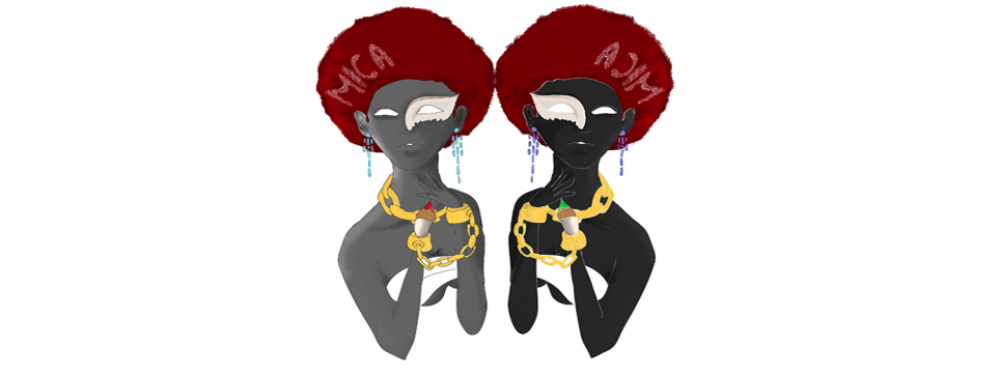
I wrote down a lot of notes from Bell Hook’s book and tried to interpret them in my own way, and I think it has definitely influenced my opinions. I want the messages in my work to definitely have substance and be direct, so I’m considering my language and the tone behind words that I use.

A few days ago there was an “article” circulating and being shared amongst a few friends on Facebook, so me being the curious person that I am decided to have a look. It was titled “Why the Hell Am I Still Dating Black Women?” So that already had me, i figured it could relate but not sure how.

As I read through, I felt the author had made about 2 or 3 interesting points regarding the mentality and attitudes that SOME black men possess about black women, and also served as a reminder of stereotypes that appear to linger around. The link to the article is here.

http://realnewspaper.wordpress.com/2014/03/06/why-the-hell-am-i-still-dating-black-women

While I already begun to feel this and explore such opinions in my work, I think reading this article helped spur me to actually create a new image.photo 1 photo 2 photo 3I decided to do a full body papercut on a larger scale, just under A2 size. Again as more paper was cut the more fiddly it was so I was worried that I might cut too deep into the image accidentally.photo 5After hours of cutting away I finally managed to finish it. It’s a summary of the negative experiences black women have faced. I was a bit worried about the placement of the text afterwards as my partner tried to read it and got a bit mixed up. The text within the body reads as follows:

I have been criticised by all around me…Abused by White men…Insulted by Black Men…Exploited by White Women…Judged by other Black Women. I am rebuked for asserting sexual freedom despite it being the most dominant and accepted image available. Offended by the weak for asserting my strength.


The wording might seem like general sweeping statements, however it isn’t actually intended to say that all white men have done this or all black women have done that and so on. However I don’t think the point would have come across clearly if I had used singular terms because it is probably not the case for every black woman that has lived-past and present-because there have been different accounts of female experience.

I might have to rethink this message or the more likely thing would be to create more papercuts that evoke different messages and take into account different female experiences in order to not sound bias and also show a journey.


Tutorials with Nick White and Pete Lloyd

2 weeks ago I had a tutorial with Nick White, showing and explaining to him all the ideas I had developed thus far. He appeared to really like the ideas and the ways that I had approached them and gave some good suggestions to take on board. As we were talking he mentioned an artist named Ellen Gallagher as a good source to look at, coincidentally I had already taken a look at some of her work. I also briefly mentioned Kara Walker and it was encouraging to hear that my work was going in a good direction, and that it was good I could link these artists to myself aswell. With the puppets he suggested I could even create an animation, have the puppets being pulled or changing size to the way the “puppeteer” wants them.

Another illustrator that he said I could reference was Sarah King, who uses different styles of text to create images and portraits. I referenced her straight after and was actually in awe of her work-the detail, how everything was composed and looked clean and elligible.

While I could defintely understand and see it could go in that direction, the thought of animation absolutely scares me…for the simple fact that it is very very VERY time consuming and you have to get things so right (and also probably possess the patience of a saint). While I have actually done stop animation before I just wonder if I would leave myself enough time to try it…nearly half way to the deadline and all…

Also with the text/portrait images, the only fault that he found was that the some of the text got lost and was a bit difficult to make out.

Earlier this week I had another tutorial with Pete Lloyd. Again I think this was a good session, and Pete thought I had some very strong ideas. Also talking about the artists and my other sources of research it turns out he has actually met Kara Walker! How about that? :). He gave me a possible solution to make the text more readable, in that I could add a symbol or something in between each word to break it when I do papercut versions. He also advised that I could even get my images lasercut to a larger size and would look handcrafted, and could be used for the degree show.

All in all so far so good!

More drawings…more ideas!

Ok so the self promo unit really kicked things into gear so I could actually get my ideas on paper.

One of the first things I wanted to explore is the notion of the “bright eyed, fair skinned” image of beauty that still seems to dominate the covers of magazines and advertising.
I begun to recall a few things I’d seen over the past year or so on all of my social media such as sterotypical things associated with ‘light-skinned’ black people and ‘dark-skinned’ black people. While they were probably intended on being humorous and not having malicious intent I couldn’t help but wonder if there was real depth to this kind of thinking, and whether there had been real psychological effects on women’s outlook of themselves and others(which in turn could possibly have a physical effect).

By accepting terms such as ‘lighty’, ‘red-bone’ ‘yellow-bone’ to describe us physically, and accepting the ‘positive’ and ‘negative’ stereotypes that come with such terms, I think that contempt has been bred and that these are also responsible for creating divisions within black communities all over the world. Accepting one thing as being more beautiful than the other and criticising those who don’t “fit the grain” breeds insecurites. This is what gives media power.

From this I started to think about Barbie dolls. I remember being a kid and only ever seeing one or 2 black barbie dolls being sold over here in the UK. I searched ‘black barbie dolls’ in google and noticed that they all had a similar look to the white Barbie doll with their hair being long and straight, or curly. I started to question why wasn’t there ones with natural hairstyles: afros, or braids or locs-realistic physical markers that are assoicated with black people…and this again led me to question wheter or not it was trying to portray a particular image of beauty amongst black girls and women.

Amongst doing this search I stumbled upon an article from the Huffington Post, which mentioned a women in America who also felt these things mentioned in the last paragraph, took it upon herself to create a new line customized dolls of different skin shades, with natural haristyles not seen in stores:

http://www.huffingtonpost.com/2013/10/09/natural-girls-united-dolls-hair-makeover_n_4065398.html

Screen Shot 2014-03-10 at 15.29.01

I then remembered my “Christie” doll- the first black doll that I ever owned myself. She’s probably stored away in a box in my cellar so I google searched and saw the hair…lol what a mess. Her figure was impossible. And her eyes. I never noticed before, but she had blue/purple eyes. Really? In my mind I genuinely thought…WTAF and chuckled. This then spurred me on to try add text to the above observational painting. I wanted to be direct, but I didn’t want to sound too angry, so I don’t think saying “WHY THE F*** DO I HAVE BLUE EYES FOR” would cut it. I eventually resolved this image and I think it worked well.

Screen Shot 2014-03-10 at 15.31.07

From the dolls concept I then started thinking about marionette puppets. I felt the concept was so strong and that I could connect it with the notions of mass media being manipulative; plays with our self-esteem, constantly telling us what products will make us “better” in order to create an image of constructed beauty that doesn’t truly exist. I originally wanted to do my marionettes in black papercuts but I felt I didn’t have enough time in keeping with the self-promo unit. So I drew them digitally to see how it would come out and again I was quite happy with the outcome. I think the papercut versions however will give it more relief, and I can also make them life-sized.

Like the papercuts I did from negotiated study I wanted to have text within the containers of female bodies, so I went a bit crazy and bought as many fashion magazine publications within my means. There really is a lack of publications that feature and represent black women in comparison to white women; both in popular ones such as Vogue and Glamour and even magazines such as Black Beauty are quite hard to find in conventional shops. Anyway I drew the above images using my new Inkling pen and neatened it up using Illustrator and Photoshop. I picked said images to try and coincide with each message:

  • “I am judged for going with the status quo”

  • “I am judged for going against the status quo”

  • “I am now the ideal vision of beauty”


The refined versions are on display in the slide show below

This slideshow requires JavaScript.

I question whether or not I have been directly or indirectly effected by these factors I’ve researched in one form or another, but I’ve taken quite a personal approach within the images so far, whilst taken into account outside teachings and opinions also. Then again if I didn’t take it personally then I wouldn’t have been affected at all…right? And these images wouldn’t be as powerful without substance and actual feeling toward the issues I’m looking at. I’m hoping I can continue pushing forward with these.

Promotion of Self….

2 weeks ago at uni we received our briefs for the self-promotion unit, and today was the deadline to post everything off to at least 5 prospective art directors, agencies etc for commissions.

We had creative reign over how we could do this, be it through posters, booklets, badges and so on. It definitely helped that they had a tons of examples on show.

Initially I was worried because I felt as if I still didnt have a substantial body of work to send off, and the fact that we actually only had 2 weeks to do this really put the pressure on. Funnily enough this really spurred me on to get stuck in with creating images and working on my concepts for FMP, so I think it worked out in the end.

marionett1

I ended up making booklets with off white covers, an A4 fold out booklet with small images titled ‘Models and Marionettes’ and small double-sided fold outs with my “I am Not My Hair” papercuts which you can see below. I will make a seperate post on the new images. I also printed my logo on the envelopes…printer just about managed to maintain enough ink

Screen Shot 2014-03-10 at 15.28.19

While the process was LONG, I was quite pleased with my body of work. But I think the most difficult thing of all was deciding who to send it to…really difficult. Tbh I had no idea who to work for, and I felt like my work didnt exactly fit in the tradtional and contemporary illustration scene out there. My art is very personal and thematic. While I do enjoy working to a brief and the challenges that come with it, I also felt my work could fit more in galleries. After a few hard hours of struggling and soul serching my 5 choices were:

  1. The Lisson Gallery
  2. The Brick Lance Gallery
  3. Meiklejohn Illustration Agency
  4. IWANT Design Ltd
  5. Eye Magazine

There are also a few others that I found I want to send my other copies to which I hope to do at a future date. They wanted the samples in different formats along with other things.

Finally a drawing…

20140218-232802.jpgMy mind started wandering a bit…and I felt like I was gonna explode from spending so much time doing research so I began drawing a figurine my mum bought for me when she went Tenerife last October (she LOVES collecting figurines). Coincidentally the figurine happens to be of an African woman, adorned with gold and holding a vase.

20140218-232825.jpg20140218-232837.jpgAlthough the complete image isn’t finished because I want to add text to it, the drawing/painting is finished20140218-232947.jpgI used a mixture of pencil, gold pen and gouache.

Portfolio tutorial

I had my portfolio tutorial just under 2 weeks ago, so that we can start creating strong portfolios to showcase to clients for illustration work and commissions…

My  current and past art work varies so much it kind of shows me as all over the place…it’s both a pro and con; that I’m able to work in such a variety of styles and enjoy doing so, however it might also suggest that I don’t really know who I want to work for or what type of illustration I want to branch off to…(worrying for clients lol)

So I sat down with Jonny and Pete who basically told me what I’ve written above. They believe I have a strong body of work which is a positive, and suggested that I start anew with my portfolio, putting in images that are a part of FMP and even a few from my negotiated study as they are all theme related. They also suggested that I was more fine art because my strongest pieces of work seem to address issues.

The tutorial helped put things into perspective…I can still work in a variety of ways but it’s made me realise that personal themes and issues seem to be a source of strength in alot of my workphoto 1